Please note: the changes in this blog post will only be visible on sites that have been upgraded to the New Look. If your site hasn't been upgraded yet and you'd like to upgrade, please email support@studystays.com.
Some time was spent over the last week looking at how to improve the search experience for students.
The feedback received was that students often jump into a basic search from the front page and end up with many pages of results which they were then having to go through manually. It wasn't clear to students that they could use the "Rooms" and "Properties" links to access the full array of search options to narrow their search.
Based on this feedback, there have been a number of subtle improvements made to the way search works.
-
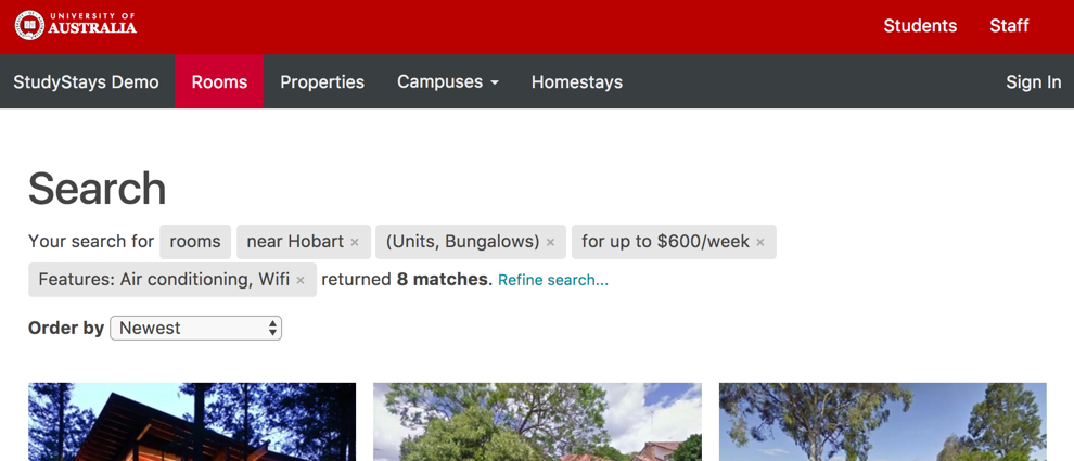
Narrowing the search: There is now a "Refine search..." link at the top of the search page which will take students back to the full search form. Moving between the search form and back to "Refine search" will keep all their current search criteria.
- Widening the search: Search facets (e.g. "near Hobart", "for up to $600/week") are now highlighted with grey labels and they can be removed from the search screen without having to go back and redo the search, by clicking the little cross next to each facet.
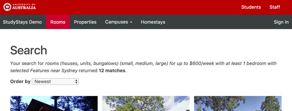
Before

After


I hope you find these improvements beneficial.