I'm pleased to announce that StudyStays now works a lot better on phones and other mobile devices.
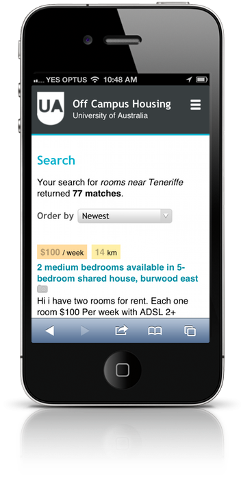
We've done this by making StudyStays adapt to small screens. When you access a StudyStays site on a mobile device, you're still loading the same page that you would on a desktop computer, but visual elements are condensed and re-formatted to make the most of limited screen space. You can see how it works on a desktop computer by resizing the browser window—you'll see the layout change as you drag the window in smaller. Try it out!
For this update we focused on public and student-specific areas of the site. This is stage one of our mobile plan—we'll be looking at mobile-improvements for landlords next.
Mobile will be a high priority for us going forward. In the last 10 months we've seen a 30% increase in mobile visits, and mobile now makes up about 12% of all visits to StudyStays sites.
I'd like to say a big “thanks” to Pete for working on this update!