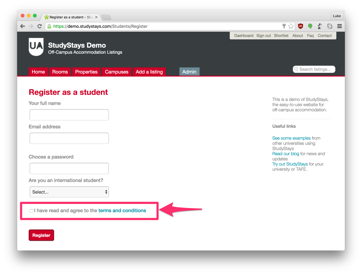
There is a new setting that lets your choose how to present your terms and conditions to students and providers when they register. We're calling the new option "Speedbump Terms and Conditions" because it slows people down a bit to focus their attention on the terms.
Option 1: The Tick Box
This is the default option if you don't change anything. It shows a tick box with a link to read the full terms and conditions.


This option makes it quick and easy to register, while still ensuring that students and providers agree to the terms. It's fairly common practise to do it this way, but it does mean you'll get people who are legally bound by the terms but haven't actually read them. If your terms and conditions are an impenetrable wall of legalese, then it might be best to stick with this option. You can then send plain-English information in the welcome email that gets sent after registration.
Option 2: The Speedbump
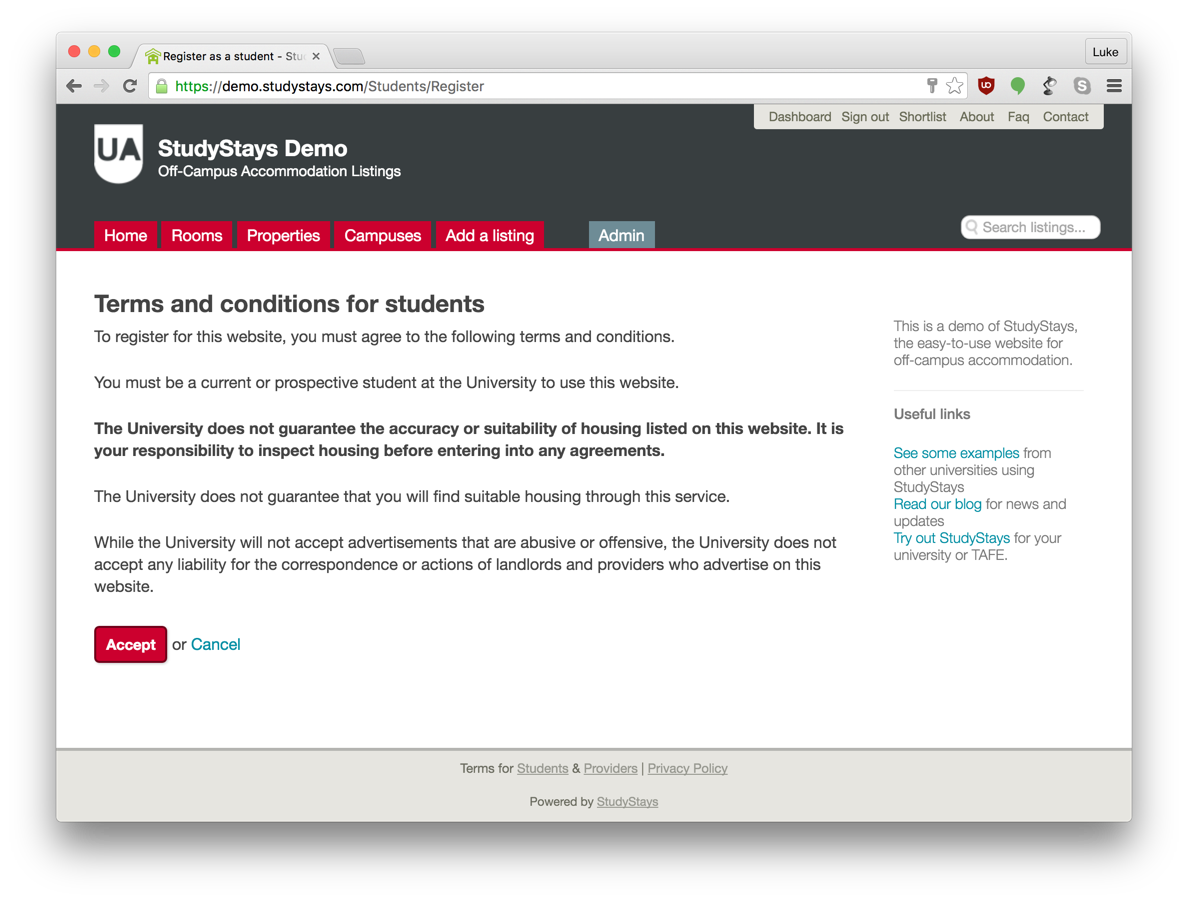
This is the new option. Instead of the tickbox, terms and conditions are displayed full-page after people click the 'Register' button:


This should work well if you have conditions that are fairly easy to read. It's still fairly unlikely that people will read much of this text, but you can call their attention to a few key sentences or words by selectively bolding them.
Choosing an Option
Choosing an Option
You can change this option by selecting 'Speedbump-style terms and conditions' under Admin > Settings > Website. If you don't choose the new option, you'll stay with the default tick box terms and conditions.
Editing Terms and Conditions
Whichever option you choose, the way you change your terms and conditions is the same: just edit the relevant page under Admin > Content > Pages.